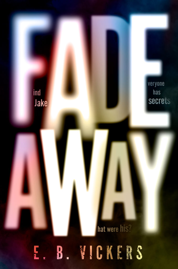
I couldn’t be more thrilled to be sharing the cover of my debut young adult novel–and I couldn’t be more thrilled with how it turned out!
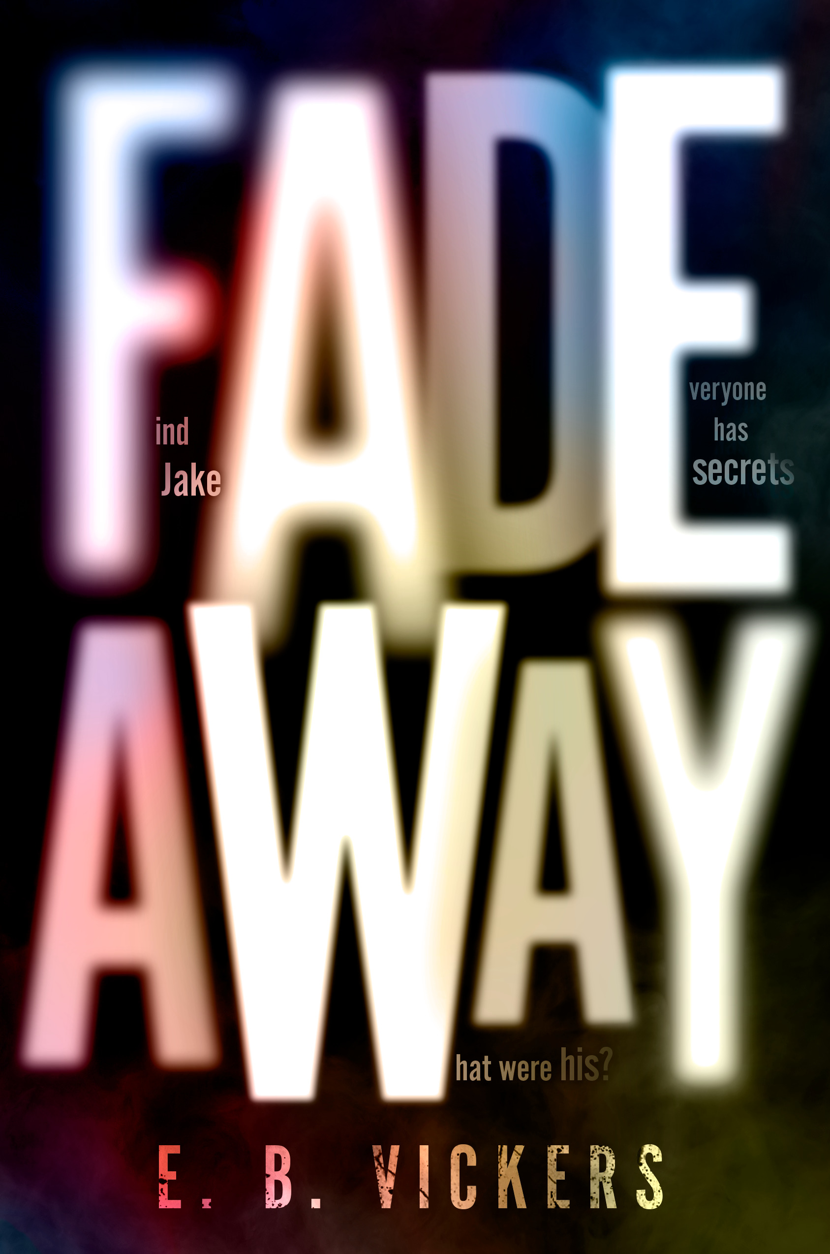
Here are my top five things to notice about Neil Swaab’s brilliant design that make it not only an incredibly engaging cover, but one that’s perfect for the story inside:
- The fact that things almost appear black and white at first glance. But as you look closer, you see subtlety and shade in a full spectrum of color. You have to look at it more than once to really understand everything that’s going on.
- Along those lines (pun intended), the mix of clarity and blurred edges.
- The way Neil plays with depth and layers of meaning. (“Fadeaway” is a basketball term, and there’s basketball in this book, but it’s about so much more than that.)
- The fact that the cover itself asks a question. (Oh, reader, I hope you’re asking lots of questions as you make this journey.)
- The cracks and fractures in the author’s name at the bottom. Those are required for any author writing any book.
AHHHHHH!!!! I love it all so much, and I can’t wait to share the rest of the story with you! Coming March 23–but available for preorder now!

